Overview
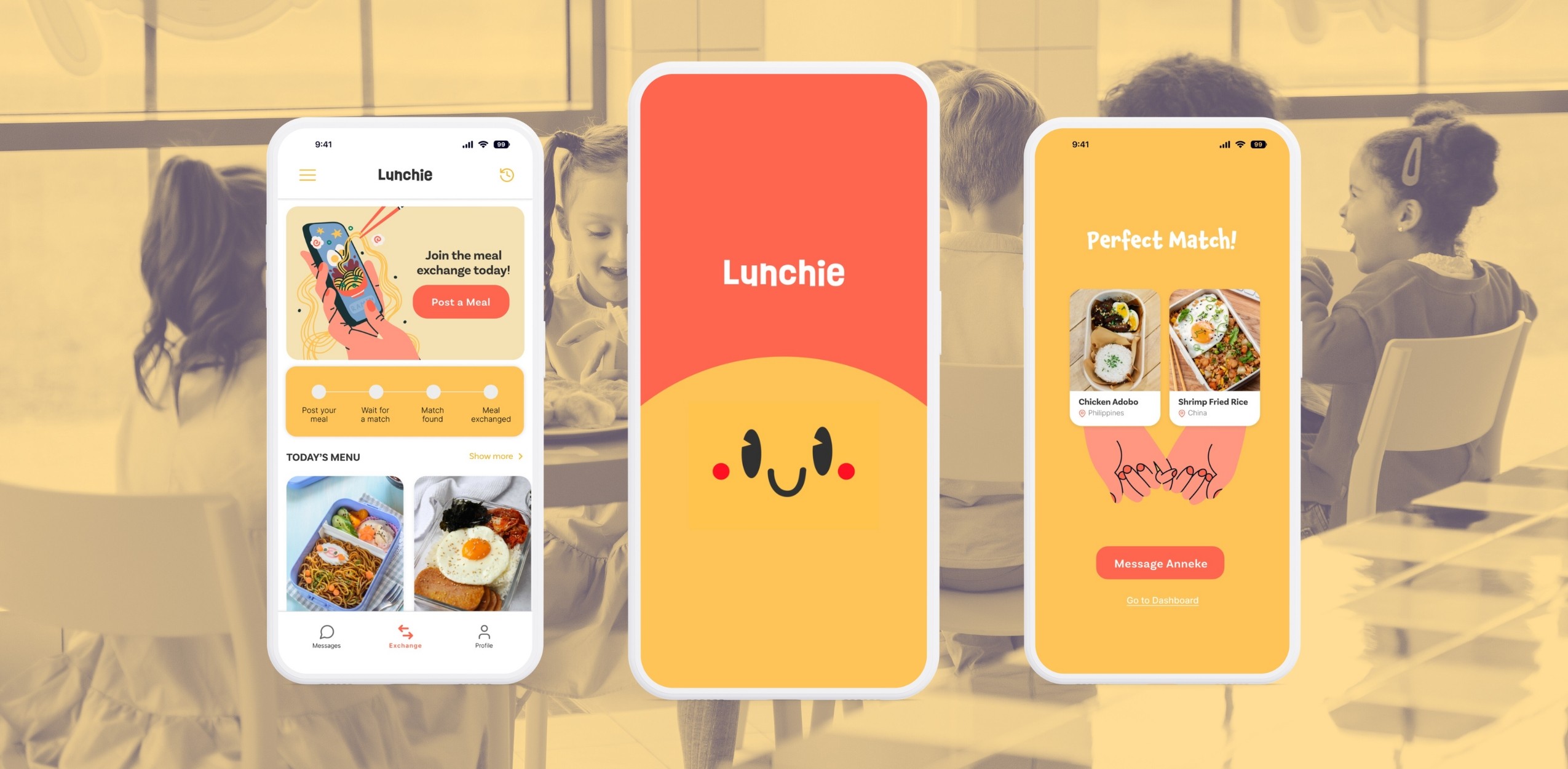
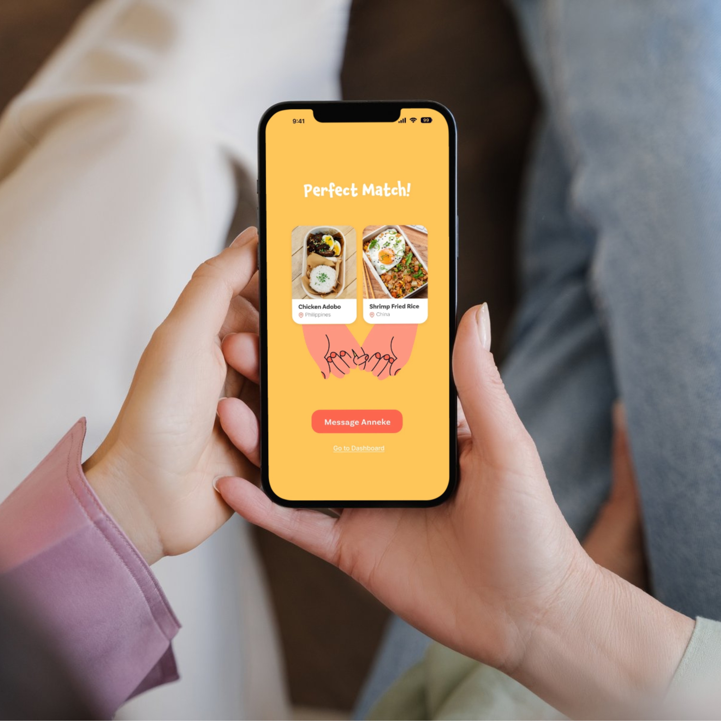
Lunchie is a conceptual mobile app aimed at helping busy parents expand their children's culinary experiences. It facilitates meal exchanges with classmates, offering kids a chance to try diverse foods. Though still speculative, the project is based on initial user research.
Background
Children's food experiences can shape their cultural perceptions. Studies show that exposure to diverse foods fosters positive attitudes toward other cultures and reduces culturally insensitive behavior and bullying.

The Challenge
When kids only eat a limited variety of food, they might not fully understand or appreciate different cultures. This can lead to negative views and misunderstandings toward those cultures.
My Solution
Foster diversity and inclusivity among children by providing them with accessible opportunities to discover new cuisines and experiment with a variety of foods through
a user-friendly mobile app.
Understanding the Users
Based on our research, we decided to target these users:
Parents: Introduce their children to different foods that shape their attitudes towards cultural differences
Teachers: Create a significant impact on children’s exposure to diverse cuisines and their understanding of different cultures.
We conducted an online survey but due to time constraints with a limited sample size, consisting of 13 parents and 5 teachers. Although the sample is relatively small, it provides valuable insights from key stakeholders, offering an initial understanding of the perspectives and concerns of both parents and educators.

Based on the challenges and objectives of the target users, we developed personas to aid us in designing our products to better meet the needs of our users.

Designing the User Flow
We divided our main user flow into four parts to clearly define the necessary functionalities and simplify the process of achieving the user's goal.

Planning The App's Structure
Although we have two target user groups, we prioritized building the experience around our primary users, who are the parents, as they will have more interaction with the app than our secondary users, who are school teachers.

Wireframing
During our brainstorming session, we sketched ideas for our product's visual aspect and created wireframes to present in class. Initially, we envisioned a dating app-like experience for matching children's lunchboxes. However, we identified several flaws in the user experience, leading to numerous revisions in the final design.

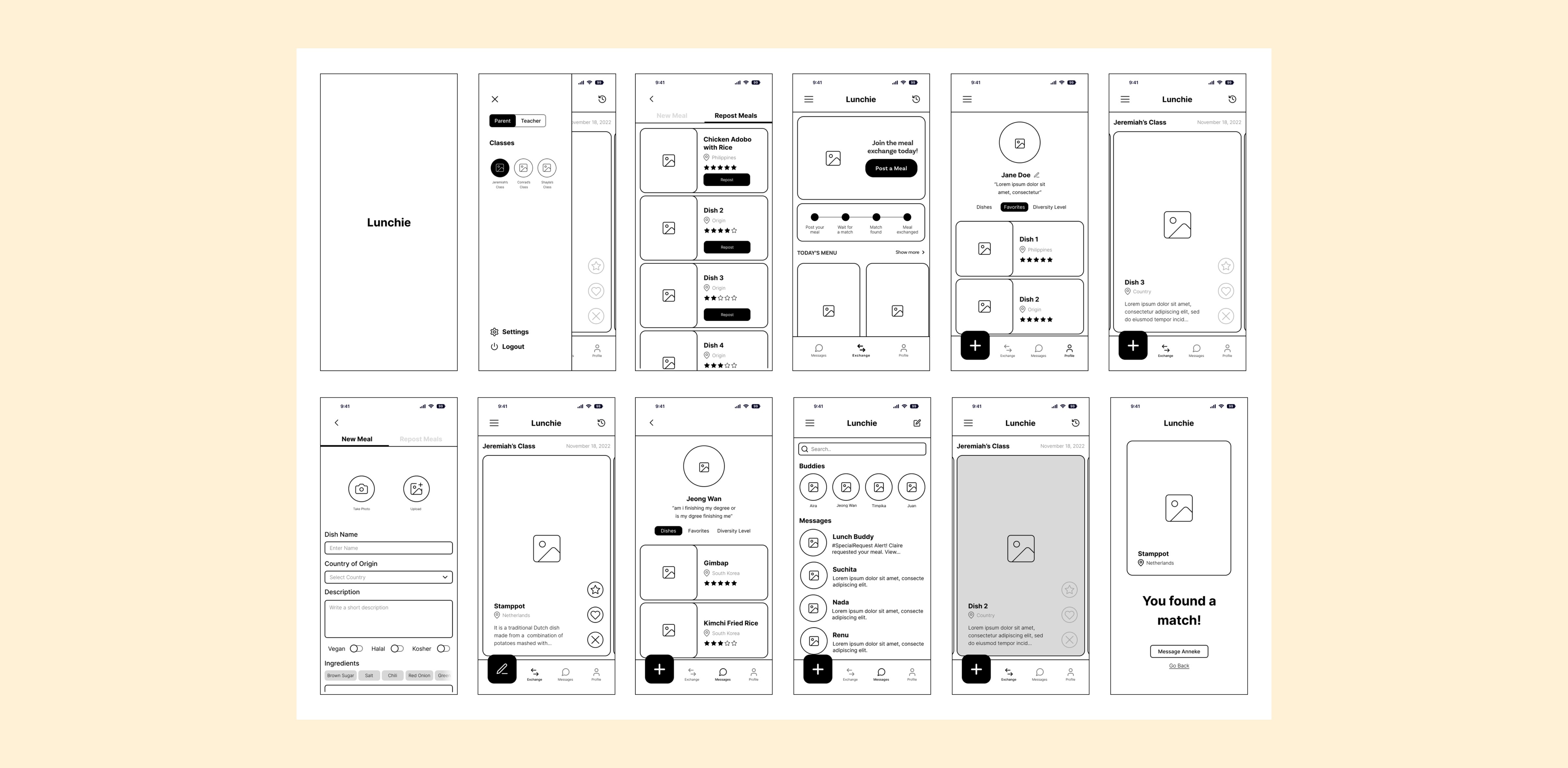
Major Design Iterations
We did weekly presentations in class during which we shared the changes and reasons behind those decisions. We also did several user tests, which helped us reach the final designs for this product.

#1. Home Screen
Our initial design for the home screen was limited to displaying "Today's Menu" for two reasons:
👉🏻 Firstly, our original user experience concept was influenced by dating apps, and
👉🏻 Secondly, Our research suggested that visually appealing food would entice users to join the meal exchange, so we initially emphasized this. However, after user participation, we realized this design was unsuitable. We redesigned the home screen to prioritize key exchange information over "Today's Menu."
The Meal Exchange
It's designed as a central hub for users to access all features and information. A prominent call-to-action card encourages engagement, while a status bar tracks meal exchange progress. The 'Today's Menu' section sparks excitement and motivates participation.

Posting a Meal
The app prioritizes convenience for busy parents.
👉 The 'Save Draft' feature enables users to plan ahead before sharing a meal.
👉 The 'Repost Meal' feature streamlines the process by allowing them to effortlessly select a previously shared meal without the need to re-enter all the details.


Choosing a Meal
Users have the chance to enhance their chances of being matched with dishes that pique their interest.
👉🏻 The Lunchie Recommended Stamp highlights dishes that are specifically tailored to a child's preferences and progress, empowering parents to diversify their child's palate.
Special Requests & Messaging
When users send a 'Special Request', parents receive
a notification. Notifications are accessible in the message history for easy tracking. Profiles of other parents in the class are also available in the Messages tab, facilitating open communication.


Rating System
Lunchie's rating system enhances meal exchanges by providing users with insights into meal quality and fostering trust within the community. It promotes accountability, helps users make informed meal choices, and enables personalized meal suggestions based on past preferences.
Key Takeaways
👉🏻 This project, though conceptual, offered a comprehensive view of digital product creation, highlighting the importance of user research.
👉🏻 Engaging with people and understanding their perspectives during the project highlighted my enjoyment in connecting with users and the impact it has on product development.
👉🏻 Through this project, my proficiency in Figma significantly improved, especially in creating and utilizing components and styles.
Check out my other prjects
This website is designed by me in Framer.
Copyright © Mark Magnaye 2024. All rights reserved.
Get in touch: blokmagnaye@gmail.com
