Overview
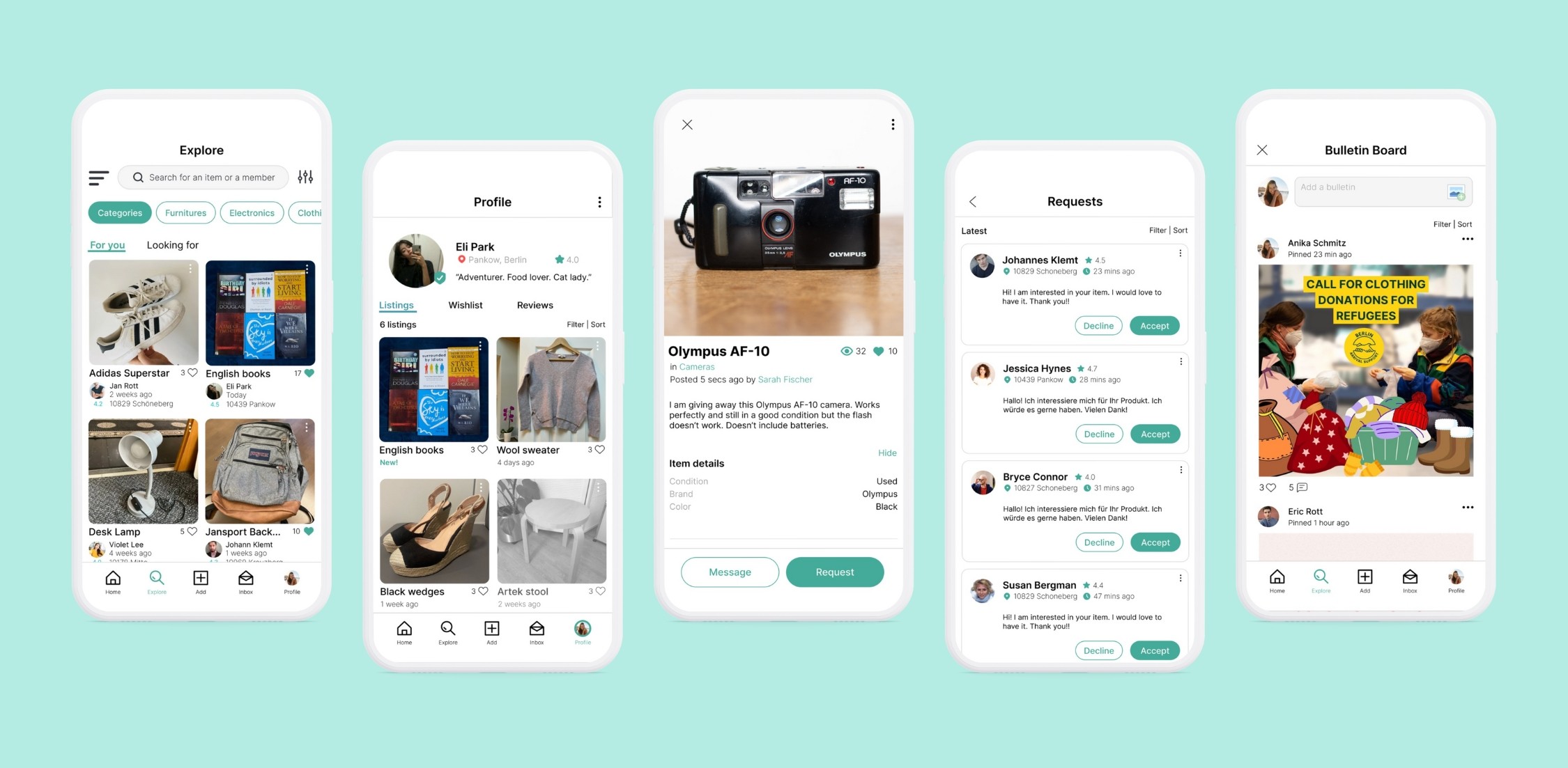
The 'FREE Your Stuff Berlin' app lets users easily give away, trade, or exchange unwanted items, inspired by the popular Facebook group. The app improved on user experience with features like in-app messaging, item categorization, a rating system, and strong security features.
Background
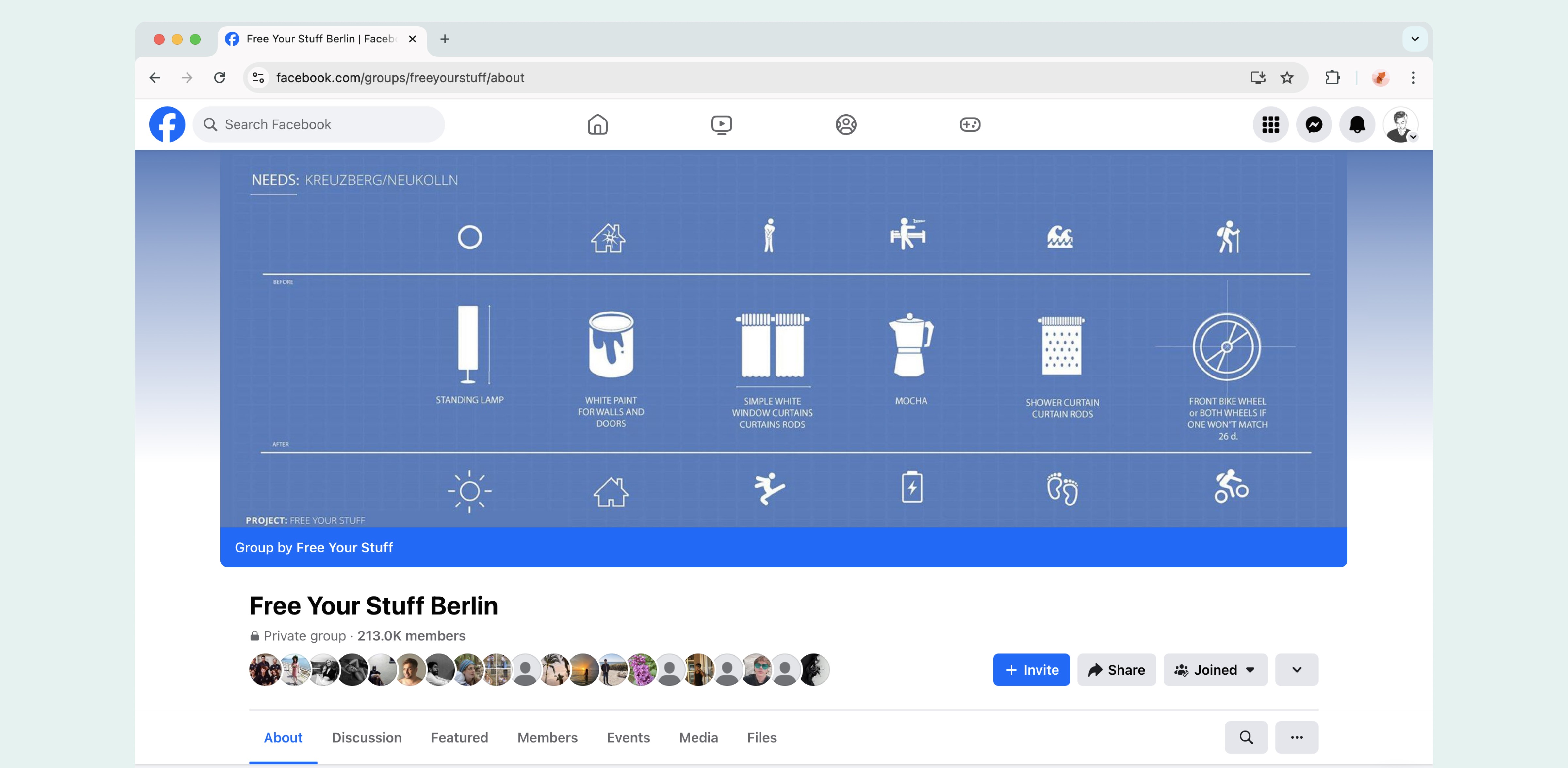
Free Your Stuff Berlin is one of the largest online exchange platforms in the city, with over 213,000 members. It's a vibrant space where people can give away unwanted items and find free treasures, fostering both sustainability and community. While the group is highly active and popular, the current platform on Facebook lacks the ideal features to streamline these exchanges. There's significant potential to enhance the user experience by developing a dedicated app specifically designed to facilitate smoother, more efficient transactions.
The Challenge
Develop a mobile app version of the group that prioritizes user-friendliness and effectively resolves common issues and challenges experienced by group members, all while maintaining the group's unique spirit and essence.
Goal and Objectives
Enhance the user experience: Create a user-friendly interface and easy navigation to enhance group participation and engagement.
Understanding the Users
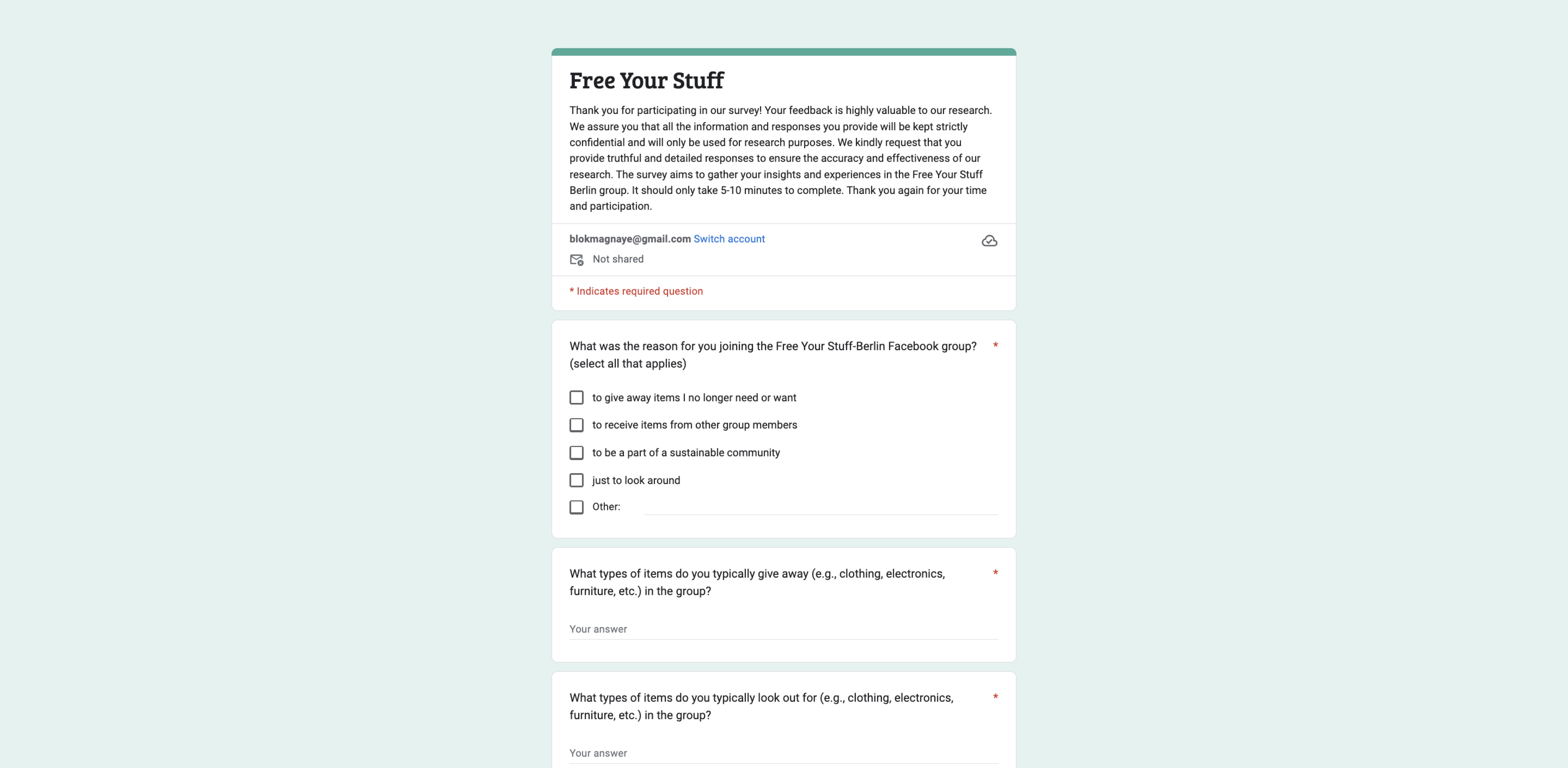
I interviewed active users to understand their experiences and pain points. I also surveyed them to learn about their concerns regarding their experience in the Facebook group and get suggestions for features they'd want in a mobile app similar to the Facebook group.
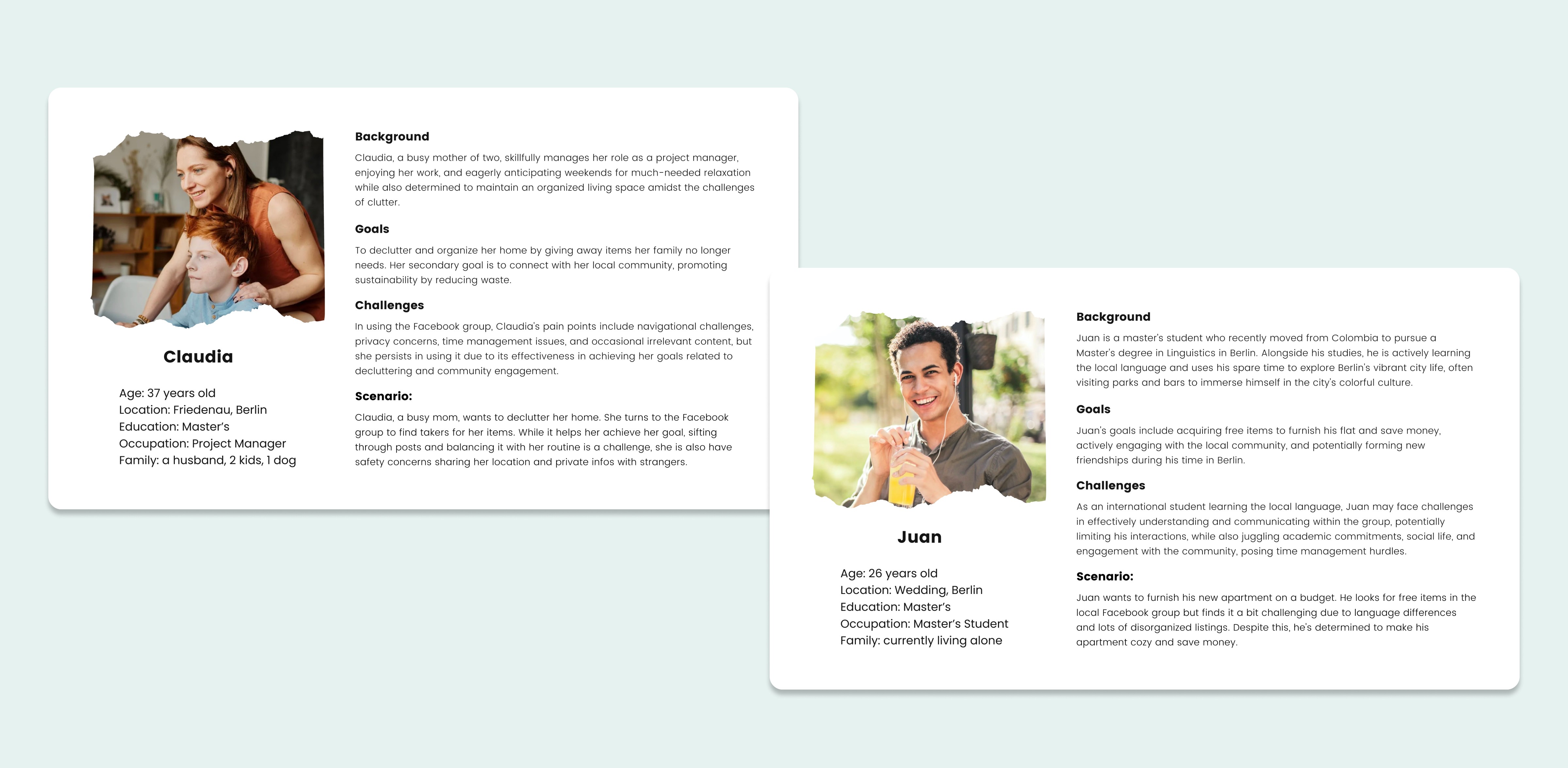
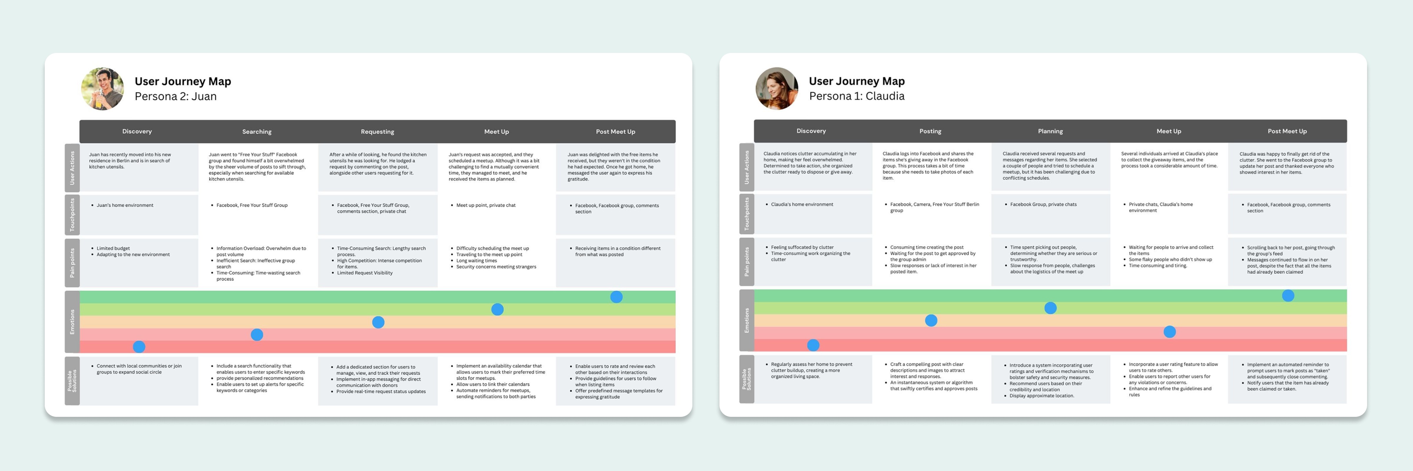
After observing the group and conducting interviews and surveys, it became clear that there were two main types of users: those who give items away and those who seek to acquire items in the group. I created two distinct user personas based on these distinctions. Additionally, I included more details about the users' age, financial status, and motivations.
Pain Points
❌ Information Overload
Users may feel overwhelmed by the sheer volume of posts, making it challenging to find specific items or relevant information.
Coordinating item pickups and negotiations through Facebook comments or direct messages can be slow and and prone to misunderstandings.
The lack of effective categorization or filtering options may result in difficulties finding items that match their interests or needs.
Users might have concerns about safety when meeting strangers for item exchanges and may also worry aboutthe honesty of item descriptions.
Competitive Audit
I studied competitors like Kleinanzeigen, Carousell, and Olio to understand what users expect from similar apps. This helps meet or exceed user needs. I looked at successful features and areas for improvement in these apps. This analysis shaped the features in the Free Your Stuff app and helped tackle design challenges.
Wireframing
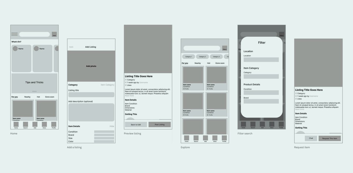
I started designing by making paper sketches, organizing the app's layout and features. Then, I made a detailed digital version for usability testing.
Usability Testing
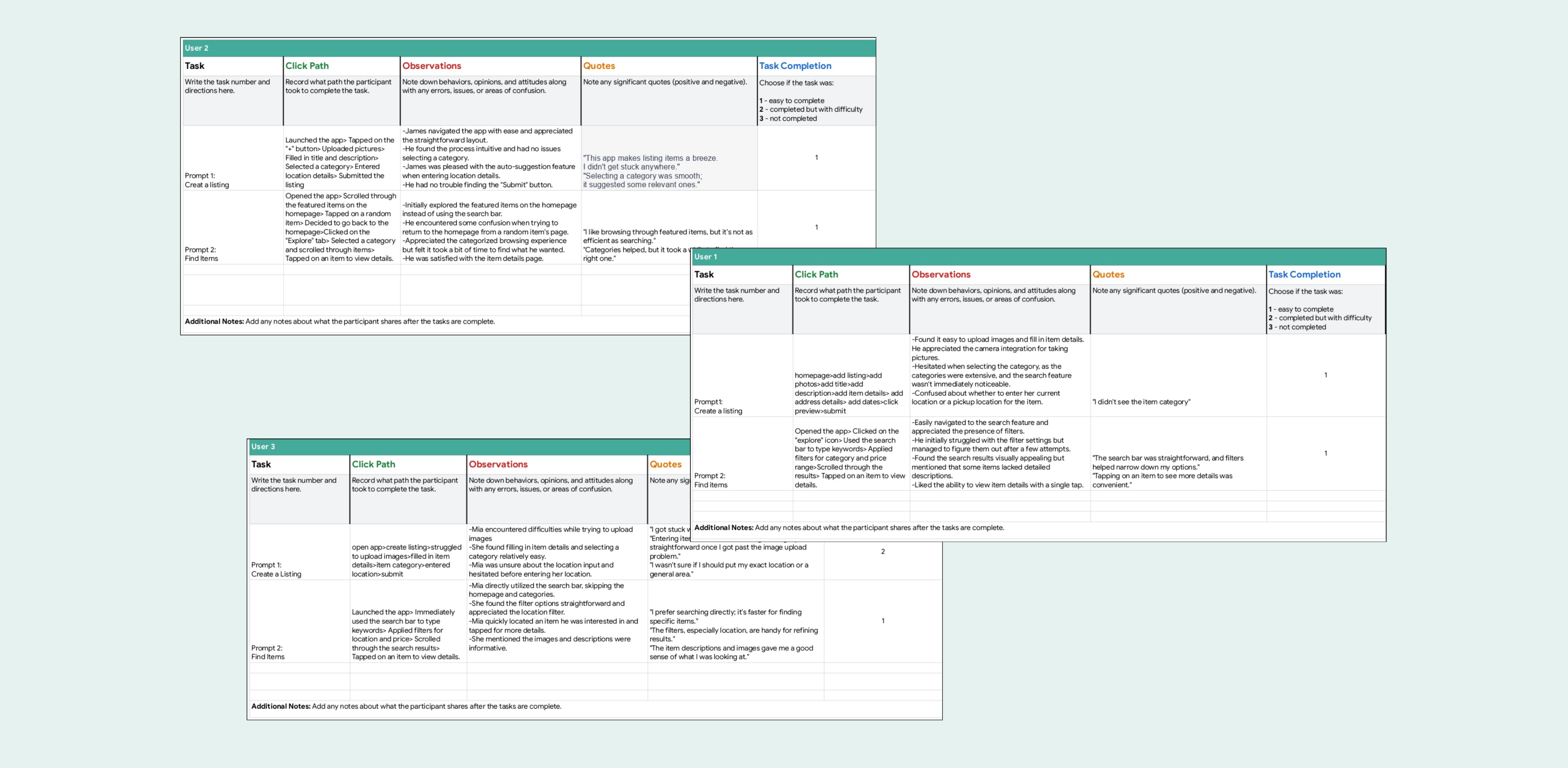
I recruited five diverse participants for usability testing: 2 male, 2 female, and 1 non-binary person. Three were from Berlin, and two were international. One participant had impaired vision. This mix helped avoid biases. They were asked to post an item and search for/request another during the testing.
Key Features
I studied competitors like Kleinanzeigen, Carousell, and Olio to understand what users expect from similar apps. This helps meet or exceed user needs. I looked at successful features and areas for improvement in these apps. Combined with user insights, this analysis shaped the features in the Free Your Stuff app and helped tackle design challenges.
Listing an Item
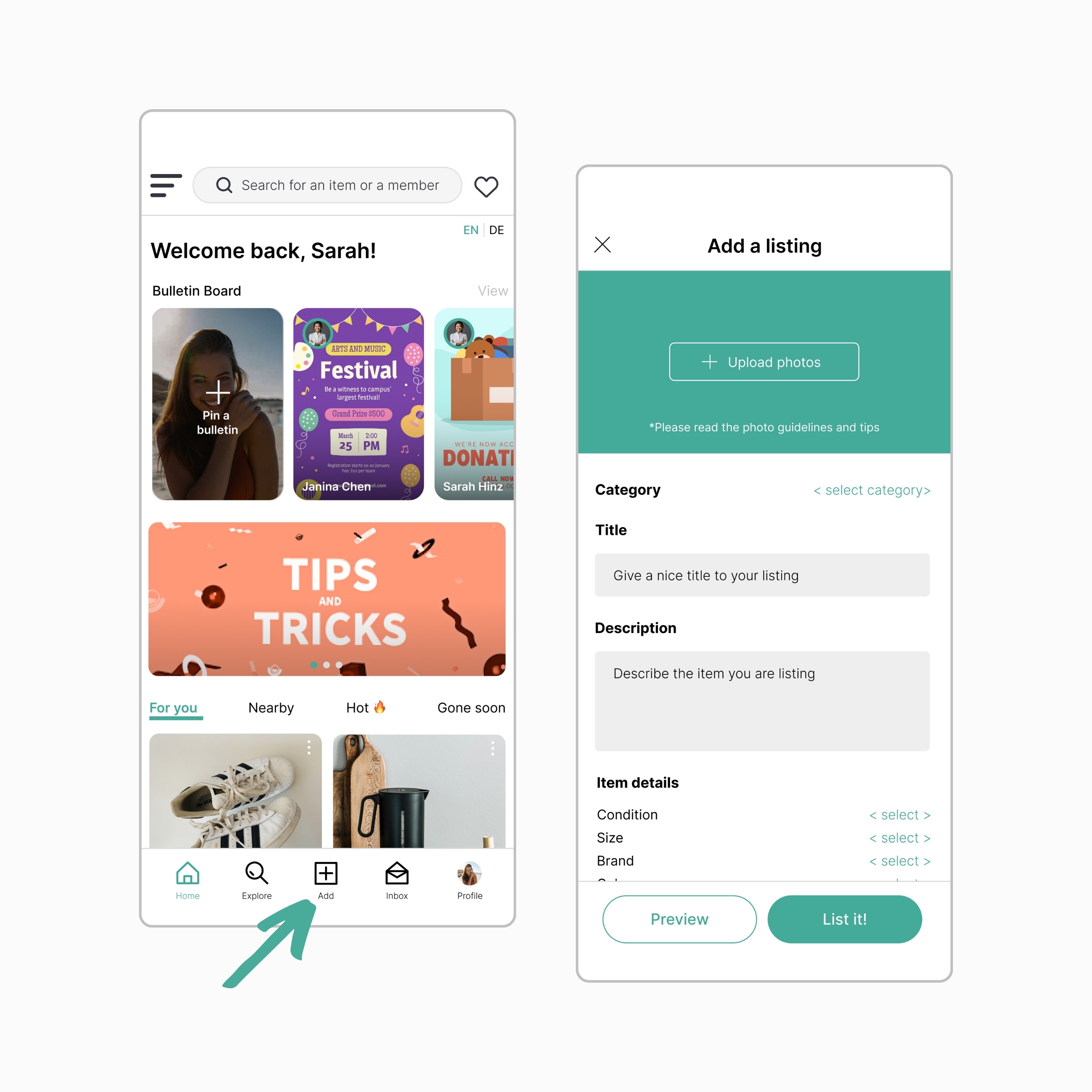
Listing an item is easy and prominent in the app. The "Add Listing" button is prominently located in the navigation bar. Users can upload pictures, add a title, and write descriptions. They can also preview their listing and save drafts for later posting.
Requesting an Item
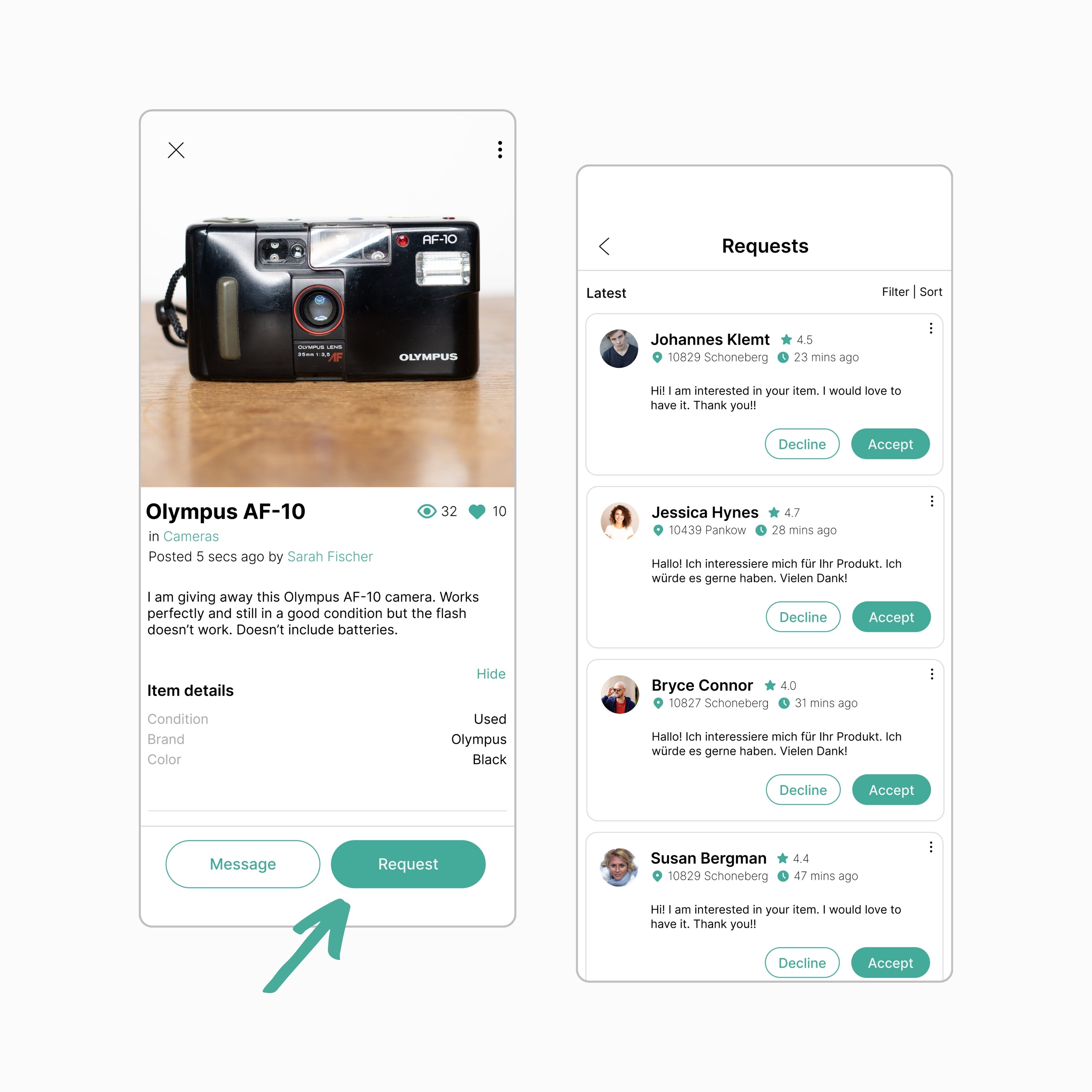
I've added a new item request system to make it easier for users to show interest promptly. Instead of commenting on the listing, users can simply click the request button. This helps the lister manage requests efficiently, ensuring none are missed. This streamlined process simplifies item requests for users and speeds up the selection process for the lister.
Item Categorization
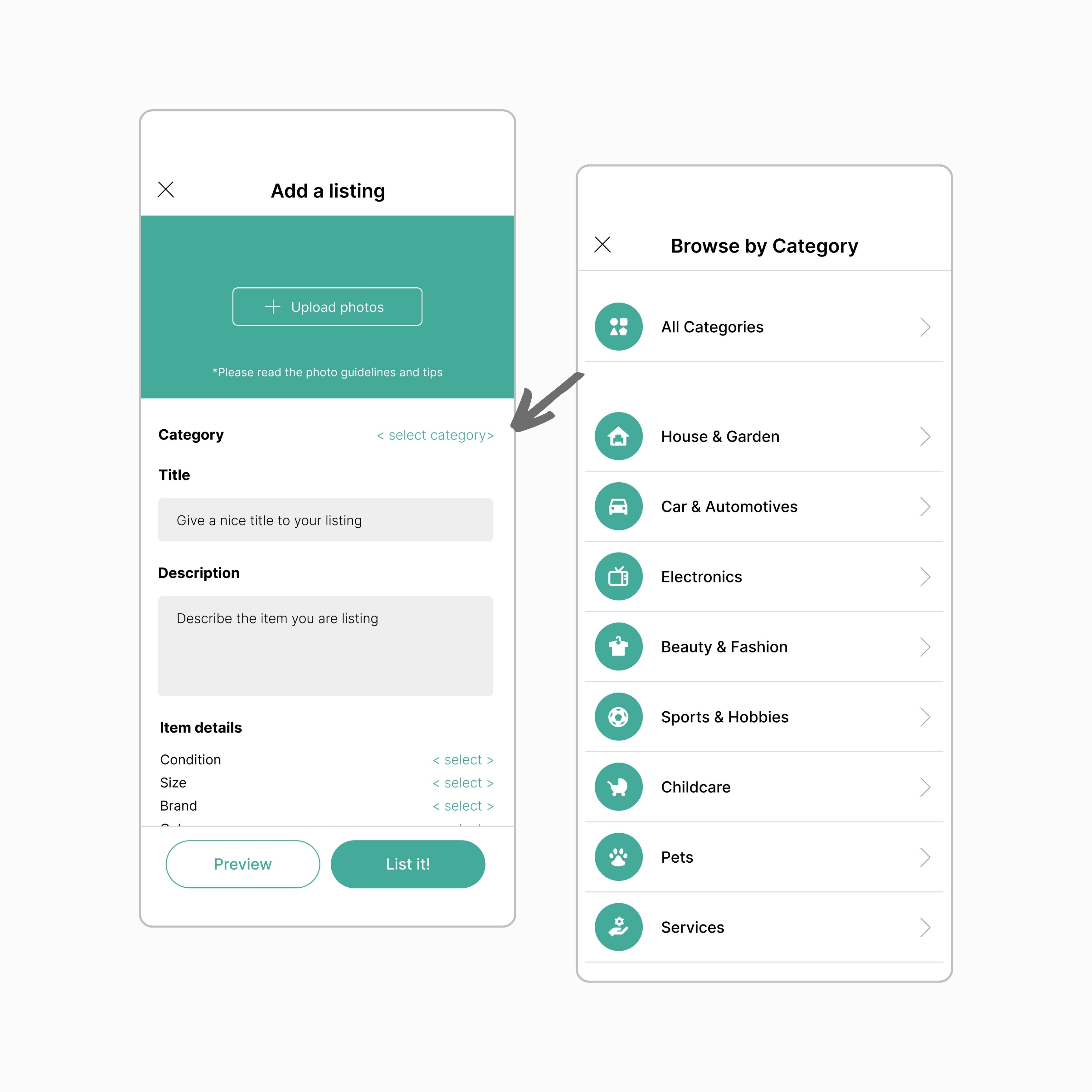
To make it easier for users to navigate listings,
I implemented a categorization system. This improves organization and helps users quickly find items within specific categories, reducing confusion and frustration. The goal is to enhance the user experience with a structured and efficient platform.
Optimized Search
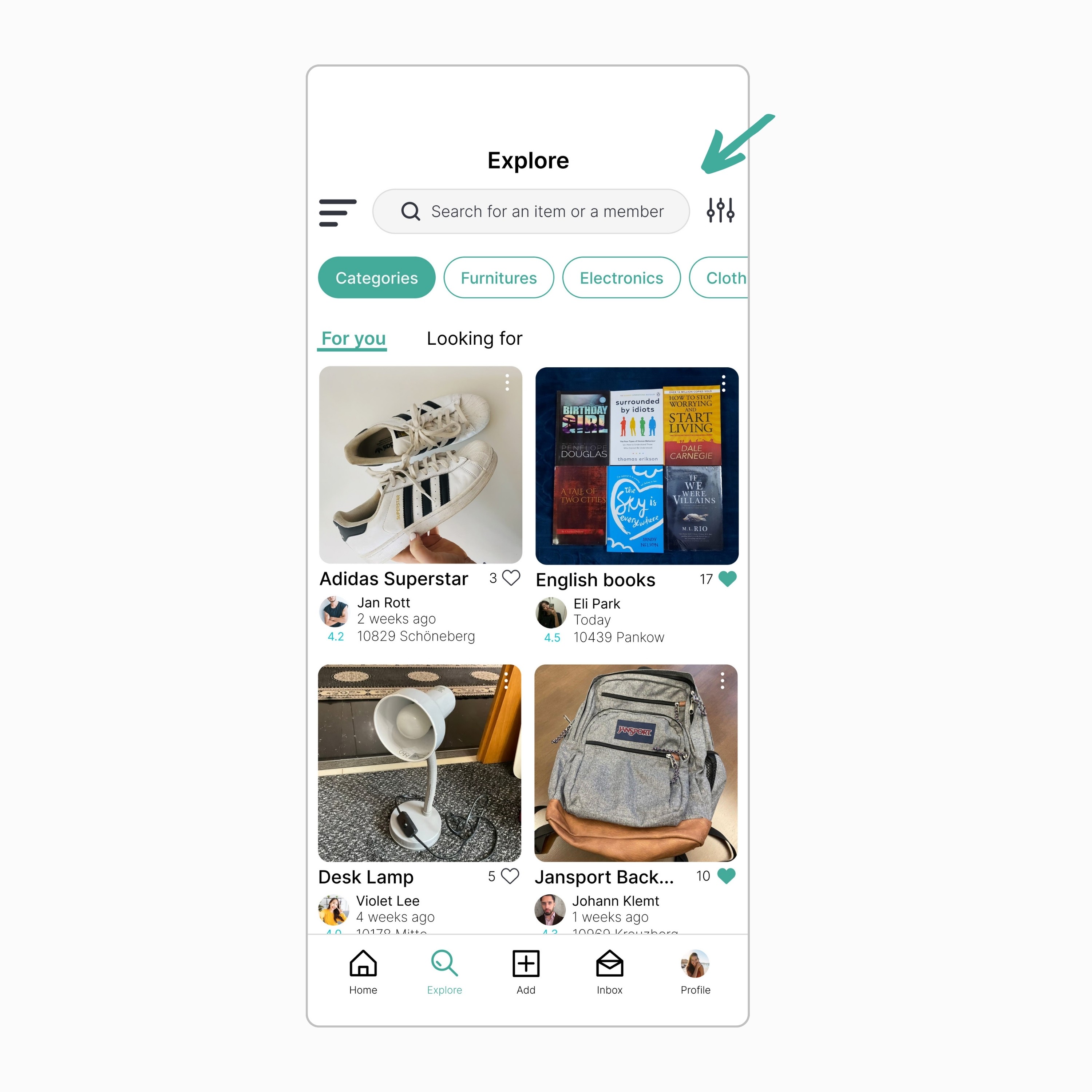
Users found it frustrating not being able to search for specific posts in the Facebook group. Now, they can search for both items and other users within the app. This search feature is flexible, letting users explore any category and sort results by factors like posting date or item condition.
User Reviews & Ratings
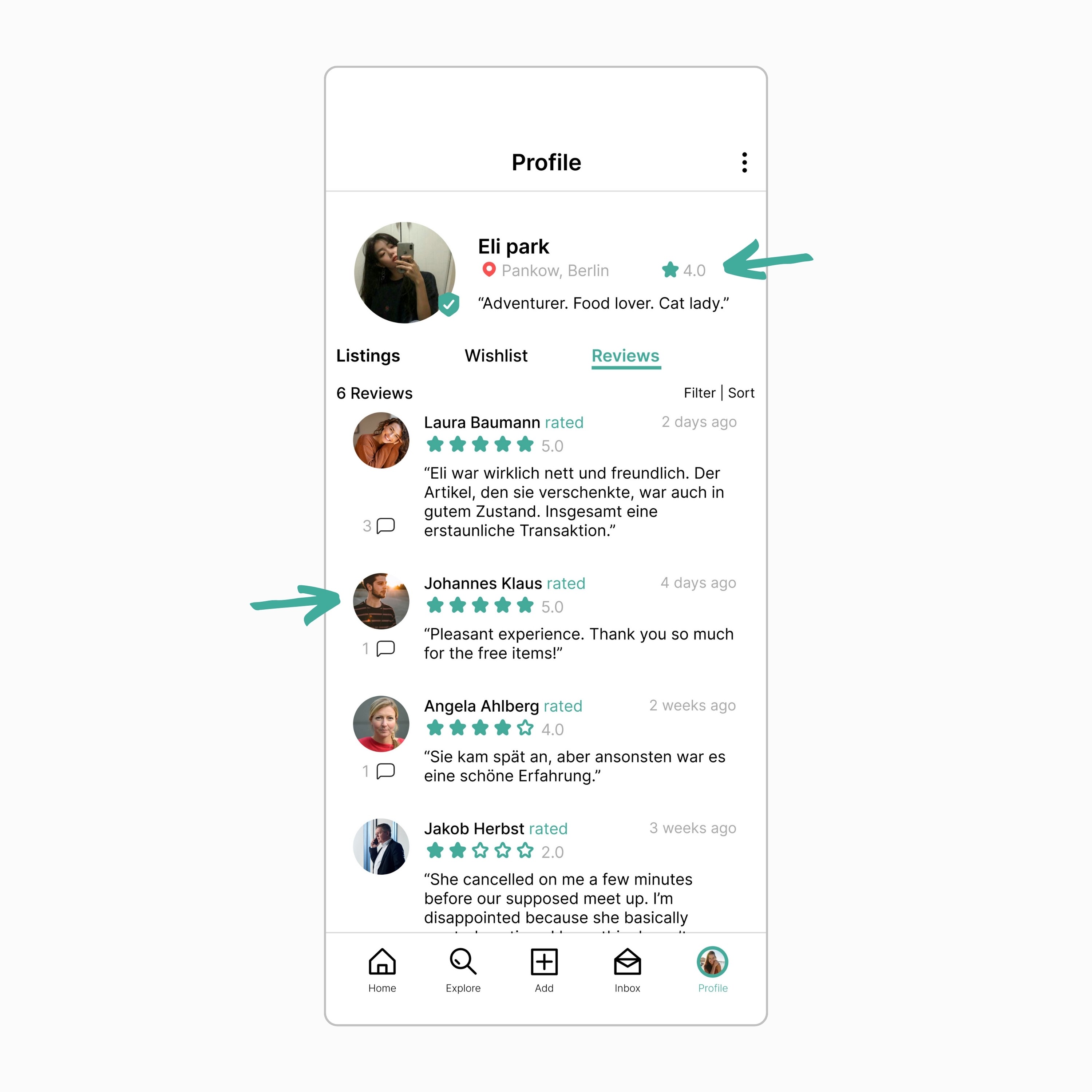
To improve security and reliability, I added a rating and review system to the app. Users can share their experiences by reviewing and rating others, as well as their transactions. This system builds trust, offers valuable feedback, and creates a safer, more dependable community in the app.
Security Features
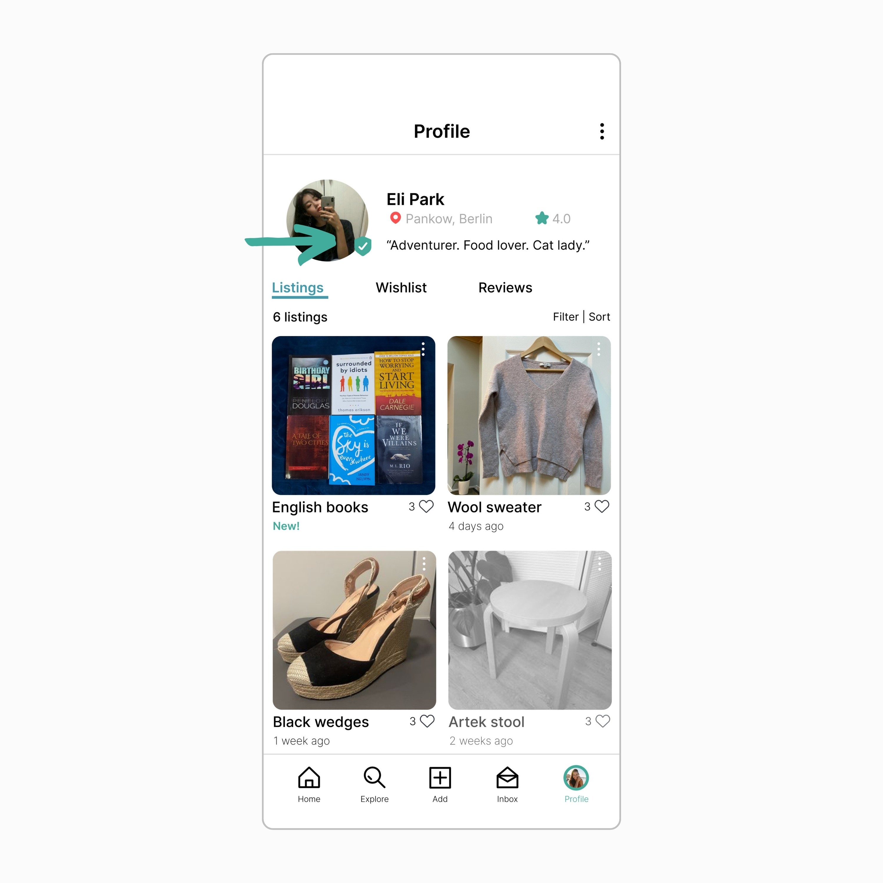
For added security, I've implemented user verification. Users are prompted to verify their profiles, adding an extra layer of protection by confirming their identities and creating a safer environment within the app. This helps build trust, prevents fraudulent activities, and ensures the authenticity of users, contributing to an overall secure user experience.
Notifications & Reminders
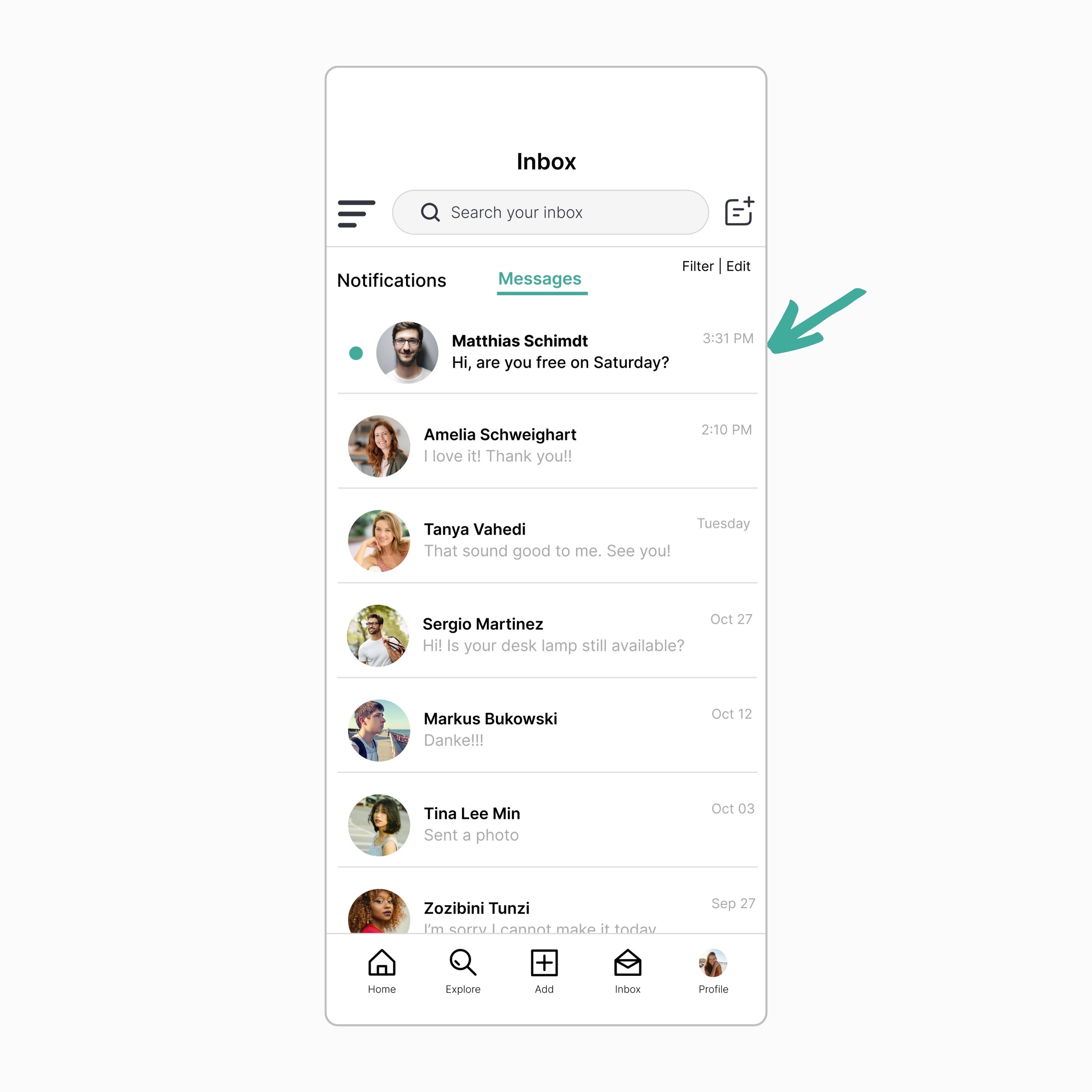
Users get notifications for item requests, ensuring quick responses. There are also reminders to schedule meetings with other users to ensure transactions happen on time. These features improve productivity, time management, and create an organized experience in the app. By facilitating efficient communication and transactions, everyone benefits from a smoother, more reliable user experience.
Bulletin Board
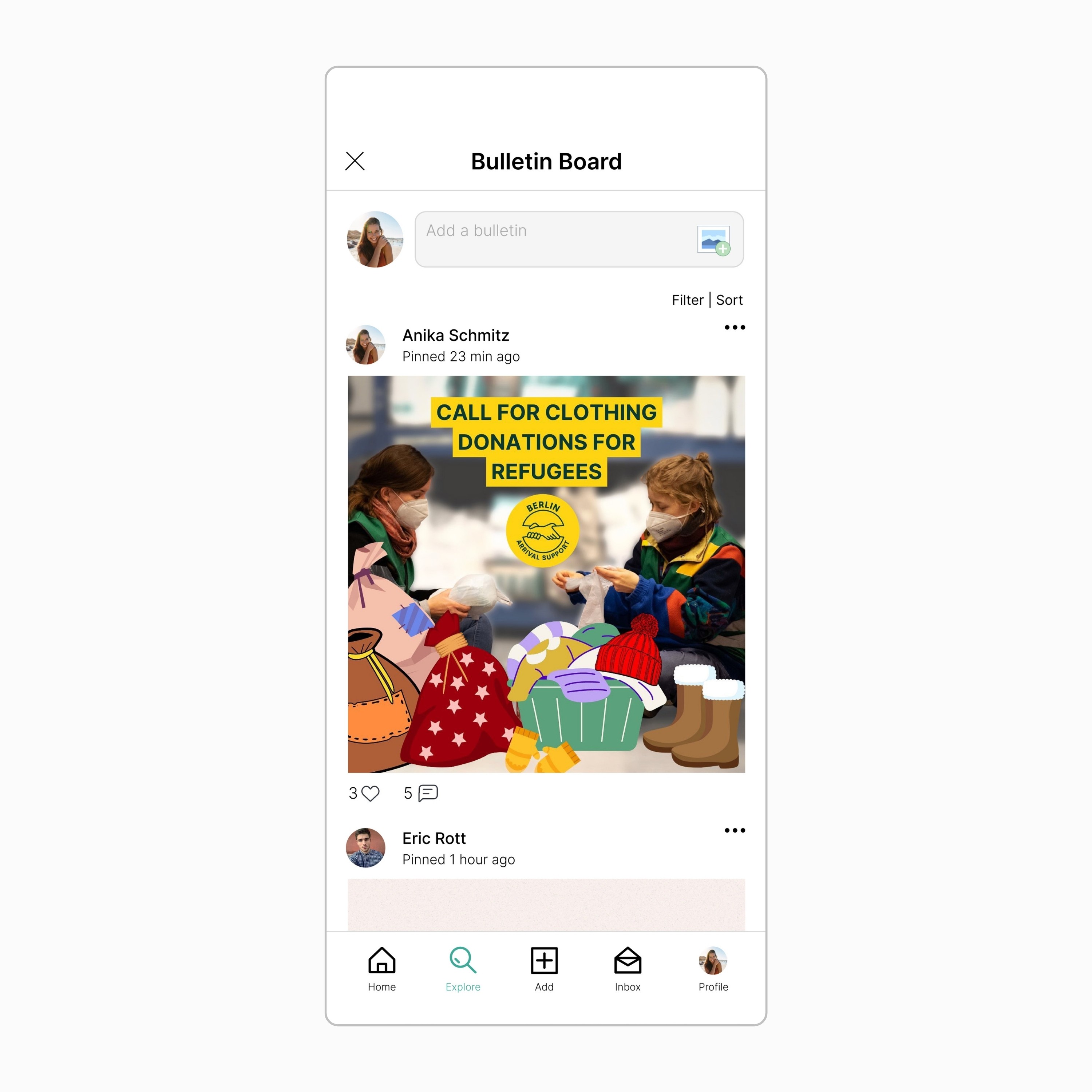
To maintain the community spirit of the Facebook group, I've added a bulletin board. Here, users can pin posts, creating a central hub for announcements and events. This organized space keeps everyone informed and engaged, fostering a strong sense of connection among users.
Key Takeaways
👉🏻 Designing an app is a big task, especially when revamping an existing system. The key is to focus on what users need and what bothers them.
👉🏻 Users want an app that's easy to use, secure, and fosters community. We also need to think about accessibility and language diversity since our users are from different countries and have different abilities.
👉🏻 When testing the app, it's important to include a diverse group of people to make sure we cover everyone's needs. While we can't control everything, security and reliability are very important to users, especially for in-person meet-ups.
👉🏻 We should make sure the app has features to make transactions secure and address these concerns directly.
Check out my other projects
This website is designed by me in Framer.
Copyright © Mark Magnaye 2024. All rights reserved.
Get in touch: blokmagnaye@gmail.com


